•
不好,就不说为啥。。
-拓跋丝瓜-
♂
![]()
![]() (0 bytes)
()
02/26/2016 postreply
08:21:01
(0 bytes)
()
02/26/2016 postreply
08:21:01
•
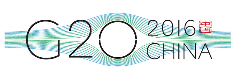
中间的圈圈代表中国?:)
-我也说句实话-
♀
![]() (0 bytes)
()
02/26/2016 postreply
08:22:03
(0 bytes)
()
02/26/2016 postreply
08:22:03
•
Logo 创作构思:
-水中捞月-
♂
![]()
![]() (1369 bytes)
()
02/26/2016 postreply
08:26:22
(1369 bytes)
()
02/26/2016 postreply
08:26:22
•
interal-connected only world in the information age
-拓跋丝瓜-
♂
![]()
![]() (0 bytes)
()
02/26/2016 postreply
08:28:00
(0 bytes)
()
02/26/2016 postreply
08:28:00
•
很不好,容易让人有不雅联想。
-翩翩~~-
♀
![]()
![]() (0 bytes)
()
02/26/2016 postreply
08:26:53
(0 bytes)
()
02/26/2016 postreply
08:26:53
•
哈哈,想太多了吧?
-王伍-
♂
![]() (0 bytes)
()
02/26/2016 postreply
08:30:29
(0 bytes)
()
02/26/2016 postreply
08:30:29
•
求解释,求开导。。。
-1.-
♂
![]() (0 bytes)
()
02/26/2016 postreply
08:39:47
(0 bytes)
()
02/26/2016 postreply
08:39:47
•
第一眼看它,想到了人的眼睛.中间的圆圈多象人的眼球.
-lindaaa-
♀
![]()
![]() (0 bytes)
()
02/26/2016 postreply
08:43:02
(0 bytes)
()
02/26/2016 postreply
08:43:02
•
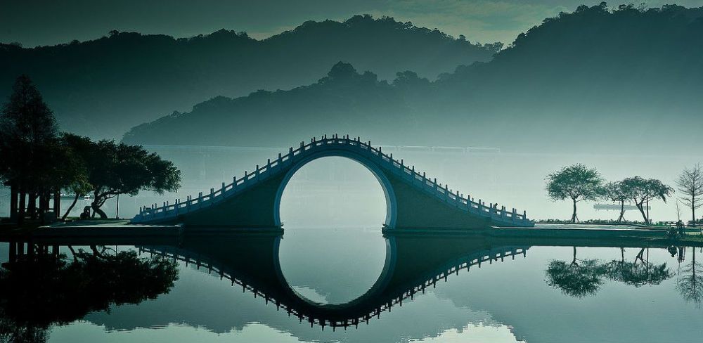
很单薄的感觉。若无相片备注,看不出桥和水的意向。可谁会在Logo下面还捆绑一个相片呀。
-稻穗儿-
♀
![]()
![]() (0 bytes)
()
02/26/2016 postreply
08:29:43
(0 bytes)
()
02/26/2016 postreply
08:29:43
•
好幼稚
-vertIsshiki-
♀
![]()
![]() (0 bytes)
()
02/26/2016 postreply
08:31:09
(0 bytes)
()
02/26/2016 postreply
08:31:09
•
这个logo不难看,就是字体上有点死板与不协调.
-lindaaa-
♀
![]()
![]() (0 bytes)
()
02/26/2016 postreply
08:35:46
(0 bytes)
()
02/26/2016 postreply
08:35:46
•
绝对可以蒙我了:-)
-ppingann-
♀
![]() (0 bytes)
()
02/26/2016 postreply
08:36:41
(0 bytes)
()
02/26/2016 postreply
08:36:41
•
看照片以前我看出是一座桥和倒影了,不过用时大概半分钟,有点长。
-每天都是好晴天-
♀
![]()
![]() (0 bytes)
()
02/26/2016 postreply
09:04:17
(0 bytes)
()
02/26/2016 postreply
09:04:17
•
背景可否放上涉及国家的地图?也许可让logo丰满点。
-每天都是好晴天-
♀
![]()
![]() (0 bytes)
()
02/26/2016 postreply
09:05:52
(0 bytes)
()
02/26/2016 postreply
09:05:52
•
现在不是都流行减肥吗?要这么丰满干啥?
-王伍-
♂
![]() (0 bytes)
()
02/26/2016 postreply
09:24:47
(0 bytes)
()
02/26/2016 postreply
09:24:47
•
很好,赏心悦目
-happycow222-
♂
![]() (1 bytes)
()
02/26/2016 postreply
09:21:22
(1 bytes)
()
02/26/2016 postreply
09:21:22
•
桥背拱得太高给人莫名其妙的感觉。如果一定要为它想一个原因,
-cdwb-
♀
![]() (248 bytes)
()
02/26/2016 postreply
09:44:23
(248 bytes)
()
02/26/2016 postreply
09:44:23
WENXUECITY.COM does not represent or guarantee the truthfulness, accuracy, or reliability of any of communications posted by other users.
Copyright ©1998-2024 wenxuecity.com All rights reserved. Privacy Statement & Terms of Use & User Privacy Protection Policy
 选择“Disable on www.wenxuecity.com”
 选择“don't run on pages on this domain”