Some geneticists have expressed their unease about a figure in a high-profile Nature paper that was published earlier this week1, noting that it could be misinterpreted as reinforcing racist beliefs. The figure has reignited a long-standing debate among geneticists about how best to discuss and depict race, ethnicity and genomic ancestry, given how these terms can be misinterpreted and weaponized by extremists.
Ambitious survey of human diversity yields millions of undiscovered genetic variants
“The problem is, a lot of people will see figures like this as supporting a viewpoint” that race and ethnicity are closely aligned with genetics, says Ewan Birney, deputy director-general of the European Molecular Biology Laboratory in Cambridgeshire, UK. “And then they build castles in the air from all this.”
Alexander Bick, a physician and geneticist at Vanderbilt University Medical Center in Nashville, Tennessee, who co-authored the paper in which the figure appears, acknowledged in an e-mail to Nature’s news team that “it’s clear that the figure fell short of our intended goal for this paper”. (Nature’s news team is editorially independent of its journal team.) But Bick defended the analysis, noting that it is a “faithful representation of the patterns that exist in the data that is consistent with representations in other similar studies” and that he is not planning to submit a correction to remove the plot.
Stirring debate
The paper is part of a larger package of articles published on 19 February that detail the progress and initial analyses of the All of Us programme, run by the US National Institutes of Health in Bethesda, Maryland. The programme aims to tackle inequities in genetics research by assembling detailed genomic and health profiles for a diverse group of one million people in the United States by the end of 2026.
Within hours of the papers’ publication, population geneticist Jonathan Pritchard at Stanford University in California posted on the social-media platform X (formerly Twitter) to share his concerns about the figure, which is intended to showcase the diversity of the first 250,000 genomes included in the All of Us database. The chart uses an algorithm called UMAP to visualize genetic relationships and participants’ self-described race and ethnicity. But a problem with using UMAP, Pritchard wrote, is that it can exaggerate the distinctiveness of populations and fail to represent their intermixing properly.
In reality, “genetic variation is a continuum, and thus genetic ancestry cannot be objectively carved out into discrete groups”, says Roshni Patel, a statistical geneticist who works with Pritchard at Stanford University.
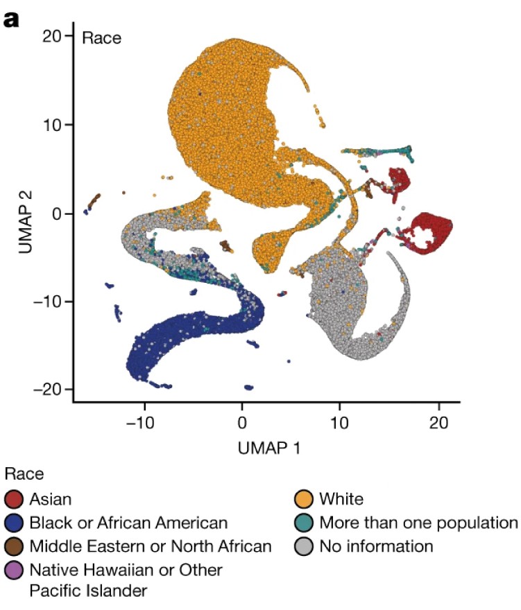
An excerpt from a figure in a Nature paper that some geneticists say could be misinterpreted to reinforce racist beliefs. Source: Ref 1.
To a layperson, the chart shows several distinct colourful blobs that could be misinterpreted as supporting genetic essentialism — the pseudoscientific belief that racial or ethnic groups are distinct genetic categories, and that individuals of the same group are genetically similar, Birney says.
That is the opposite of what the data show, Bick says. “Our analysis reaffirms that race and ethnicity are social constructs that do not have a basis in genetics”.
A few researchers have publicly called on Nature’s journal team to retract the paper because of the potentially misleading nature of the figure. Most geneticists contacted by Nature’s news team did not think retraction was necessary, but said they hoped that the authors would acknowledge the concerns. A spokesperson for the journal says that Nature’s editors are “aware of the discussions that are taking place and are in contact with the authors”.
Public interpretation
Geneticists have become particularly sensitive to how analyses they publish are used or interpreted by the public. In 2022, an 18-year-old gunman in Buffalo, New York, attempted to justify killing 10 Black people at a grocery shop with a 180-page manifesto that included several citations and figures from genetics papers.

This ignited a debate among geneticists about their responsibility to ensure that their research does not spread in pseudoscientific circles and is not used to justify violence. “The language of some of this work showing up in other people’s violent manifestos is a very sobering reality that geneticists are having to reconcile with,” says Nicole Iturriaga, a political sociologist at the University of California, Irvine, who has studied how genetics research is co-opted by far-right groups.
But Birney says he isn’t convinced there is a “neat and pretty way of representing relationships between humans”. Human genetic relationships are best described by family trees, and any effort to squash the hundreds of thousands of people included in a data set into a single chart will leave out important context, he says. It doesn’t help that every country uses the terms ‘race’ and ‘ethnicity’ in its own way, which makes the concepts harder for the public to understand, he adds.
That doesn’t mean that geneticists should stop using charts in their manuscripts; it means that extra care is necessary to ensure that data are communicated responsibly, says Anna Lewis, a specialist in the ethical implications of genomics at Brigham and Women’s Hospital in Boston, Massachusetts. Patel adds that the All of Us researchers could have more closely followed the recommendations of a 2023 report issued by the US National Academies of Sciences, Engineering, and Medicine (NASEM) about best practices for using population descriptors in genetics research. Bick responds that the manuscript was written in 2022, before the NASEM report was published.
Despite the charged and public nature of the criticism, Iturriaga says that this is a healthy debate for the field to have. And it’s important that geneticists think about the potential for misinterpretation before it’s too late, she adds.
doi: https://doi.org/10.1038/d41586-024-00568-w
References
-
The All of Us Research Program Genomics Investigators Nature https://doi.org/10.1038/s41586-023-06957-x (2024).