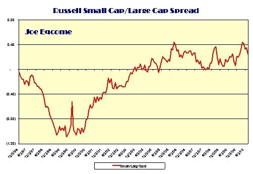
Outlook: To paraphrase Mark Twain, “While history doesn’t repeat itself, it sometimes rhymes”. This observation might be instructive in comparing the two most recent stock market cycles. (See “Financial Cartoon" here.) While investors are virtually paralyzed with regards to the depth, breadth and direction of the current stock market cycle, they have a tendency to forget the magnitude of the “dot.com” bubble bust and the subsequent recovery. Rhyming Cycles: The chart below compares the Russell 1,000 large cap stock index (12/96=1) for the ’96-‘04 stock market cycle (dot.com bubble) with that of the ’02-’10 stock market cycle (financial bubble). Despite the difference with regards to the stock cycle peaks there still is a somewhat similar cyclical pattern. Most importantly, there seems to be a retreat after the first upward leg of each recovery from the trough. Is that what we’re experiencing now? Curious Data Point: Another curious phenomenon is that the spread between small cap and large cap stocks have remained positive at this phase of the economic cycle. If the economy were deemed to be falling off a cliff, as many retail investors fear, small cap stocks should be shunned like the plague as they tend to represent early-cycle movers. I would be more concerned if this small cap spread were to significantly contract. This could likely indicate that those who still believed in an economic recovery may have given up the ghost and have joined the others in buying bonds.